Remember, Engineers are not designers!
Typography
Typography in terms of web design is basically, text, composed to create a readable, coherent, and consistent look which works for the reader.
This arrangement of text involves –
- Typefaces
- Line height
- Font Weight
- Text Colour
- Letter Spacing
- Character Spacing
- Measure
An arrangement of these which suits the clients requirement and also appeals to the user ,makes it visually appealing and attractive
You might probably think, ‘Hey! I can just pick a random font and a random color and it should be alright right?’
If you want your app to look like a 3rd grade school project you could go with the above idea, or else it’s time to change your user interface and, your attitude towards UI.
I’ll be illustrating some examples with CSS because it’s the easiest to understand and works with any website and also Flex. You can find most of these options on the Photoshop ‘Character’ panel or whatever you are using.
Typefaces usage guidelines:-
- When designing logos and headings try to stick to simple serif fonts rather than funky bitmap, calligraphic fonts, unless your client demands so specifically
- As a general rule of contrast – Light text on Dark backgrounds and Dark text on light backgrounds, so that a user can read the text comfortably without strain on the eye.
- Try to cater to the larger audience. Use system installed fonts like Arial, Helvitica etc which are universally available on every machine and are cross platform. List alternatives by using the Font-Family statement instead of sticking to a single font, in case of CSS.
- Remember not to use fonts which you have downloaded directly on to the webpage without embedding them in some form.
- Consistency: – Try to stick with one style of font for all your pages, don’t use for example Comic Sans for the heading, then Arial for the menu and Courier for the content. You may vary font weights and sizes where needed.
Getting the best out of simple fonts with CSS
People feel their creativity is limited when you tell them to use in-built system fonts. I’ll explain how this is not true with some examples
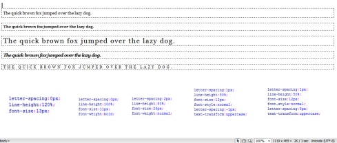
Here the first paragraph is the default rendering in Internet Explorer with no style
The second paragraph has some minimal styling applied to it as follows:-
As you can see these three properties dramatically alter the default rendering. A few variations of this could be adjusting just the four properties: – letter-spacing,line height,font-weight,text-transform
Text Colour
- Make sure your text is readable and also matches with the template or color theme of the program. While doing this make sure you know the background color of your text, what I mean to say is for example don’t put light grey text on a cream background webpage which is very hard to make out.
- Test out the colors on either paint or photoshop to see that they complement the overall theme of the page.
- Do not use colors on the fly randomly without first thinking of a color theme
- Do not use contrasting colors or vivid colors on the web page that hurt the eye.
- Use font weights to assign priorities to the text under consideration. For example, if there is an alert or a warning next to normal text content make sure both of them do not have the same weight (bold). Give the warning a higher weight than the text
Letter Spacing/Word Spacing/Line Spacing
Make sure the letter spacing and word spacing are proportionate. Do not try to fit maximum content in the minimum amount space. Don’t give the user an impression that you are throwing something at him and be like “Here is everything. Now figure it out”.
Deciding a color theme
There is no single answer to the question “What is the best colour theme to use?”. The truth is there are millions of them. How do you come up with something that suits your requirement?
In many websites the colour theme is adjusted according to the content. For example if the images in your slides/pages have a lot of purple in them, the theme will be oriented in a “purple varaints” fashion
The other way is to go by the colours of a logo. Usually you have logos ready before you start a page or a program. If your logo is light, you want a dark backround and vice versa. Also the website colours must complement the logo or the product for the webpage.
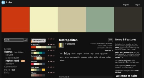
If you still aren’t getting it, try Kuler from Adobe (http://kuler.adobe.com) where you can play around colour themes people have already made and use them directly on Photoshop or Dreamweaver.
Content Padding
The padding clears an area around the content (inside the border) of an element.
Make sure you use proper padding and margins everywhere so similar containers or text don’t get too close to each other like it’s a trashcan where everything is thrown in!
The image below should give you a clearer picture about how paddings and margins work.
Some Examples of great typography
That finished the typo part. Hope this will help you at some point of your life when you design good scalable applications or RIA’s.


Leave a comment